KreditVerse x PinkyDoll
Pre-launch CRO audit for a celebrity influencer campaign targeting 40-50K visitors.

The Challenge
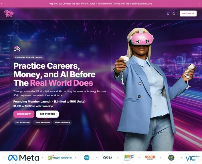
KreditVerse is an official Meta Education Solutions Partner and the creator of the first financial literacy curriculum in VR. They had just closed a deal with PinkyDoll - a TikTok creator with over 2 million followers - as their first celebrity ambassador.
The campaign was set to drive 40-50K visitors to a Shopify landing page for a $1,995 VR education kit. The page was being built by their internal team on a tight timeline, and Jeff needed an outside eye on the conversion path before launch.
The problem: a $1,995 product being sold to PinkyDoll's audience - primarily Gen Z and younger Millennials who found her through NPC streaming content. They trust PinkyDoll personally, but they're not conditioned to spend $2K on first click.
What We Found
The page had a strong foundation - real institutional authority (Meta partner, DOE vendor, active in 130+ schools), authentic influencer endorsement, and a legitimate product. But the conversion path had critical gaps.
No Single Dominant Hero Offer
The page opened with multiple competing CTAs and no clear primary action. Visitors arriving from PinkyDoll's social channels had about 3 seconds to understand what they were buying. The page didn't give them one clear answer.
Zero Social Proof Above the Fold
The authority markers - Meta partner, DOE vendor, 130+ schools - were buried mid-page and in the footer. PinkyDoll's audience lands skeptical. Those trust signals needed to appear in the first visible scroll, not after they've already considered bouncing.
CTA Paralysis
Too many choices, no clear path. Multiple buttons competing for attention with no visual hierarchy telling visitors which action to take first.
No Urgency or Scarcity
A limited founding member launch with 500 units - but none of that urgency was communicated on the page. No countdown, no stock indicator, no "founding member" exclusivity framing.
Trust Deficit
No guarantees, no risk reversal, no credentials visible where buying decisions happen. For a $1,995 product, the page needed to actively reduce perceived risk.
ICP Mismatch
The copy addressed parents buying for children, but the traffic source was PinkyDoll's young adult audience buying for themselves. The page needed to speak to both buyers without alienating either.
No Commitment Ladder
No email capture, no lead magnet, no lower-commitment entry point. Visitors who weren't ready to spend $1,995 had nowhere to go except leave.
What They Fixed
Jeff's team implemented the majority of the Audit 1 recommendations before the follow-up review. The improvements were significant:
PinkyDoll's endorsement moved to Section 2
Immediately after the hero, exactly where influencer traffic needs it. Her quote is authentic, her photo anchors the section, and the signed attribution is visible.
Dedicated domain launched
The page moved from a Shopify subpage to pinkydoll.ai - a standalone storefront with its own brand identity, separate from KreditVerse's B2B institutional site.
Hero image features PinkyDoll in the headset
Influencer traffic sees her face first. Responsive mobile variant works correctly.
Return policy reframed
"48-hour pre-activation guarantee" in the FAQ, answer leads with "Yes" instead of "non-returnable." Clean reframe from objection to reassurance.
CTAs consolidated
"CLAIM MY KIT" as the dominant primary CTA, with natural variations at different intent levels. No more CTA paralysis.
"Is this just influencer merch?" FAQ added
Directly addresses the #1 objection for PinkyDoll's audience. Answer is clear: "This is not merch. It is a structured career kit."
Product photos and video testimonials live
Visual differentiation between PinkyDoll Edition and Standard Edition. Video testimonials and partner marquee added for additional proof.
Follow-Up Audit
Two weeks after the initial audit, we delivered a second review based on the team's implementation progress. The page had gone from structurally flawed to genuinely strong. The follow-up identified 7 polish items - the kind of details that separate a good page from one that converts at its ceiling.
Shopify Placeholder Text Visible
Admin-facing helper text ("You can guide visitors to your support, contact, or checkout page here") was live in the FAQ section. A 2-minute fix that, left uncaught, reads as an unfinished page.
Trust Marquee Frozen on Mobile
The hero trust bar with Meta and partner logos used JS-dependent animation that didn't initialize at mobile viewport widths. For a campaign where 85%+ of traffic arrives on mobile from TikTok, the primary trust signal was effectively dead.
Copy Errors on Purchase Card
"Apart" instead of "a part" (meaning inverted) and "PinyDoll" misspelling - both on the $1,995 purchase card where buyers make the decision.
Price and Bonus Buried
The $1,995 price and $497 STEM bonus were in unformatted body text. Neither was bolded, underlined, or visually separated. The strongest conversion lever on the page read like fine print.
The Deliverable
Across two audits, Jeff received:
- Executive summary with ICP analysis (who's actually clicking from PinkyDoll's channels)
- 14 total findings ranked by severity - Blocker, Critical, High, Medium
- Behavioral scorecard grading authority, social proof, scarcity, urgency, commitment, liking, and reciprocity
- Specific copy recommendations and page restructuring suggestions
- Pre-launch checklist table
- Recommended page structure for optimal conversion flow
Audit 1 was delivered same-day. Audit 2 was delivered two weeks later based on implementation progress. Both arrived as professional documents ready to hand directly to the dev team.
Client Response
"This is great insight. I will take these recommendations and implement them. This should be a blueprint for us going forward."

Jeff's team implemented the majority of the audit recommendations before the follow-up review. He voluntarily paid for the second audit - no invoice, no ask. The audit became a blueprint for their ongoing page optimization process.
Want the same analysis
for your site?
Full CRO audit. Every element analyzed. Prioritized fixes delivered within 12 hours.